Android Menus
In this section you will learn about the Android menus. A menu provides a set of options. A user can select from a menu to perform a function, for example saving, deleting, searching or navigating to another screen.
Types of menus
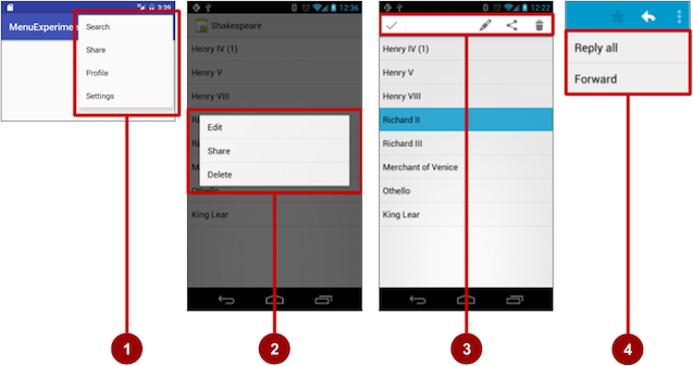
They are different types of menus :
- Options menu: Appears in the app bar and provides the primary options that affect use of the app itself
- Contextual menu: Appears as a floating list of choices when the user performs a long tap on an element on the screen.
- Contextual action bar: Appears at the top of the screen overlaying the app bar, with action items that affect the selected element or elements.
- Popup menu: Appears anchored to a View such as an ImageButton, and provides an overflow of actions or the second part of a two-part command.
The app bar and options menu
The app bar (also called the action bar) is a dedicated space at the top of each Activity screen.
- The app bar by default shows the app title, or the name defined in
AndroidManifest.xmlby theandroid:labelattribute for theActivity. - The app bar may also include the Up button for navigating up to the parent activity.
- The options menu in the app bar usually provides navigation to other screens in the app, or options that affect using the app itself. The options menu appears to thr right.
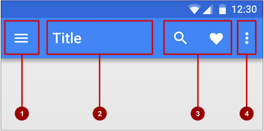
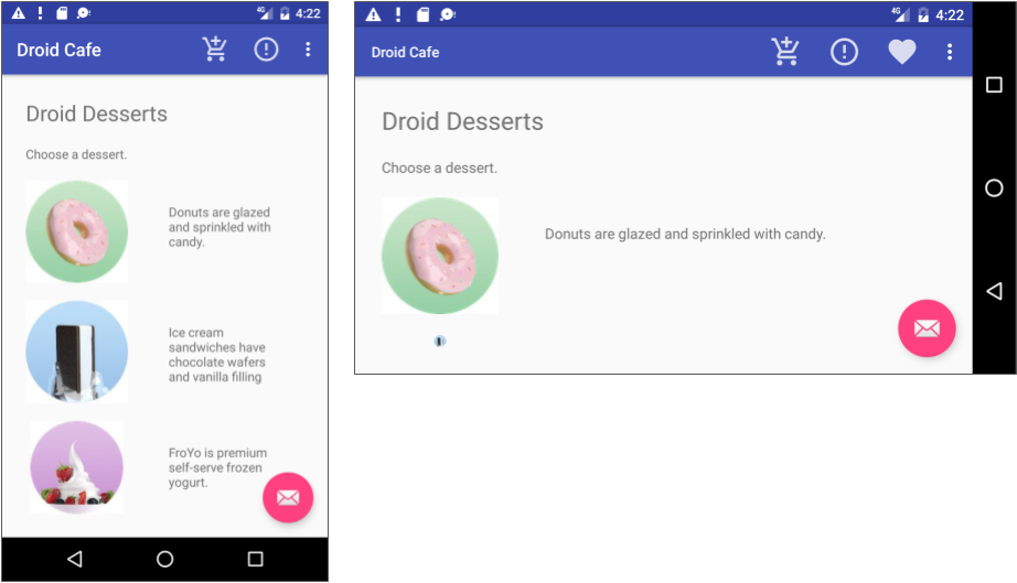
In the figure above:
- Navigation button or Up button: Use a navigation button in this space to open a navigation drawer, or use an Up button for navigating up through your app's screen hierarchy to the parent activity. Both are described in the next chapter.
- Title: The title in the app bar is the app title, or the name defined in AndroidManifest.xml by the android:label attribute for the activity.
- Action icons for the options menu: Each action icon appears in the app bar and represents one of the options menu's most frequently used items. Less frequently used options menu items appear in the overflow options menu.
- Overflow options menu: The overflow icon opens a popup with option menu items that are not shown as icons in the app bar.
Frequently used options menu items should appear as icons in the app bar. The overflow options menu shows the rest of the menu:
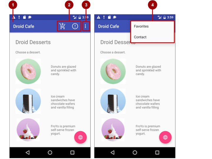
In the above figure:
- App bar: The app bar includes the app title, the options menu, and the overflow button.
- Options menu action icons: The first two options menu items appear as icons in the app bar.
- Overflow button: The overflow button (three vertical dots) opens a menu that shows more options menu items.
- Options overflow menu: After clicking the overflow button, more options menu items appear in the overflow menu.
Adding the app bar
Each activity that uses the default theme also has an ActionBar as its app bar. Some themes also set up an ActionBar as an app bar by default. The ActionBar behaves differently with each version of Android. We are going to instead use the Toolbar because:
Toolbarmakes it easy to set up an app bar that works on a wide range of devices.Toolbargives you room to customize your app bar later, as your app develops.Toolbarincludes the most recent features, and it works for any device that can use the support library.
The Toolbar comes from the v7 appcompat
To add the Toolbar, you should have the v7 appcompat and support design libraries. This is already included in the app made from the default Android app project template.
Here are the steps to add the Toolbar:
- Add the support libraries
appcompatanddesign - Use a
NoActionBartheme and styles for the app bar and background. - Add an
AppBarLayoutand aToolbarto the layout. - Add code to the
Activityto set up the app bar.
Adding the support libraries
- Open the Nuget manager
- Search for
Xamarin.Android.Support - Add the
Xamarin.Android.Supportv7.AppCompatandXamarin.Android.Support.Designlibrarues
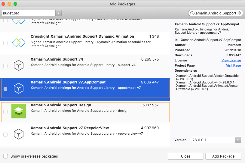
The above shows the screen from the Visual Stuio 2019 for Mac.
Install Current Versions
You should install the current versions of the support libraries. You might need to open the SDK Manager screen to update to the current versions of the support libraries.
Adding the theme
- Open the styles.xml filed from Resources -> values -> styles.xml. If the file does not exist, create one.
- Add the theme with the name
AppTheme.NoActionBar
The styles.xml should already have a theme AppTheme defined as follows :
1 2 3 4 5 6 | <style name="AppTheme" parent="Theme.AppCompat.Light.DarkActionBar"> <!-- Customize your theme here. --> <item name="colorPrimary">@color/colorPrimary</item> <item name="colorPrimaryDark">@color/colorPrimaryDark</item> <item name="colorAccent">@color/colorAccent</item> </style> |
AppTheme inherits the default Android theme
AppTheme "inherits"—takes on all the styles—from a parent theme called Theme.AppCompat.Light.DarkActionBar, which is a standard theme supplied with Android.
1 2 3 4 | <style name="AppTheme.NoActionBar"> <item name="windowActionBar">false</item> <item name="windowNoTitle">true</item> </style> |
AppTheme.AppBarOverlay, the theme for the AppBarLayout as follows :
1 2 3 | <style name="AppTheme.AppBarOverlay" parent="ThemeOverlay.AppCompat.Dark.ActionBar" /> |
and lastly the theme for the Toolbar:
1 2 3 | <style name="AppTheme.PopupOverlay" parent="ThemeOverlay.AppCompat.Light" /> |
Theme naming
By using prefixing the name with AppTheme, this overrides the styles attributes already defined in the style with name AppTheme. So the AppTheme.NoActionBar will override the styles defined in the AppTheme and add the new style attributes windowActionBar and windowNoTitle. This is similar to how CSS works in the websites.
The complete styles.xml should now be as follows:
1 2 3 4 5 6 7 8 9 10 11 12 13 14 15 16 17 18 19 20 | <?xml version="1.0" encoding="UTF-8"?> <resources> <!-- Base application theme. --> <style name="AppTheme" parent="Theme.AppCompat.Light.DarkActionBar"> <!-- Customize your theme here. --> <item name="colorPrimary">@color/colorPrimary</item> <item name="colorPrimaryDark">@color/colorPrimaryDark</item> <item name="colorAccent">@color/colorAccent</item> </style> <style name="AppTheme.NoActionBar"> <item name="windowActionBar">false</item> <item name="windowNoTitle">true</item> </style> <style name="AppTheme.AppBarOverlay" parent="ThemeOverlay.AppCompat.Dark.ActionBar" /> <style name="AppTheme.PopupOverlay" parent="ThemeOverlay.AppCompat.Light" /> </resources> |
Adding the AppBarLayout and a Toolbar
-
When adding the
AppBarLayout, it needs to be a child of theCoordinatorLayoutand theToolbarmust be a direct child of theAppBarLayoutas follows:1 2 3 4 5 6 7 8 9 10 11 12 13 14 15 16
<?xml version="1.0" encoding="utf-8"?> <android.support.design.widget.CoordinatorLayout xmlns:app="http://schemas.android.com/apk/res-auto" ...> <android.support.design.widget.AppBarLayout android:layout_width="match_parent" android:layout_height="wrap_content" android:theme="@style/AppTheme.AppBarOverlay"> <android.support.v7.widget.Toolbar android:id="@+id/toolbar" android:layout_width="match_parent" android:layout_height="?attr/actionBarSize" android:background="?attr/colorPrimary" app:popupTheme="@style/AppTheme.PopupOverlay" /> </android.support.design.widget.AppBarLayout> </android.support.design.widget.CoordinatorLayout>
-
AppBarLayoutalso requires a separate content layout sibling for the content that scrolls underneath the app bar. You can add this sibling as a view group (such asRelativeLayoutorLinearLayout) in the same layout file, or in a separate layout file. You can include the layout as follows:
or define the layout directly without using the1
<include layout="@layout/content_main" />
include. -
Set the content sibling's view group to use the scrolling behavior AppBarLayout.ScrollingViewBehavior:
1
app:layout_behavior="@string/appbar_scrolling_view_behavior"
The layout behavior for the RelativeLayout is set to the string resource @string/appbar_scrolling_view_behavior. This string resource controls how the screen scrolls in relation to the app bar at the top. The resource represents the following string, which is defined in the values.xml file (which you should not modify):
android.support.design.widget.AppBarLayout$ScrollingViewBehavior.
This behavior is defined by the AppBarLayout.ScrollingViewBehavior class. Any View or view group that can scroll vertically to support nested scrolling for AppBarLayout siblings should use this behavior.
Add code to setup the app bar
- The Activity should inherit from
AppCompatActivityin order to use the app bar:1 2 3
public class MainActivity : AppCompatActivity { ... }
- In the
OnCreatemethod callSetSupportActionBarwith the toolbar as the parameter:
1 2 3 4 5 6 7 8 9 | protected override void OnCreate(Bundle savedInstanceState) { base.OnCreate(savedInstanceState); Xamarin.Essentials.Platform.Init(this, savedInstanceState); SetContentView(Resource.Layout.activity_main); Android.Support.V7.Widget.Toolbar toolbar = FindViewById<Android.Support.V7.Widget.Toolbar>(Resource.Id.toolbar); SetSupportActionBar(toolbar); } |
There are multiple Toolbar classes
When using the Toolbar, make sure you are using the Toolbar from Android.Support.V7.Widget.Toolbar. There's also a Toolbar class defined in Android.Widget.Toolbar.
The Activity should now show the Toolbar. By default, the app name will be displayed.
Adding the options menu
The options menu is defined using XML. The menu resource file should live in the Resources -> menu folder. The menu resources defines the menu for options menu, context menu or popup menu.
The MenuInflater class is used to inflate the menu resource file and load it into the Menu.
-
Create the XML file in the Resources -> menu folder.
1 2 3 4 5 6 7 8 9 10
<menu xmlns:android="http://schemas.android.com/apk/res/android" xmlns:app="http://schemas.android.com/apk/res-auto" xmlns:tools="http://schemas.android.com/tools"> <item android:id="@+id/action_settings" android:orderInCategory="100" android:title="@string/action_settings" app:showAsAction="never" /> </menu>
-
Inflate the menu in the
OnCreateOptionsMenumethod1 2 3 4 5
public override bool OnCreateOptionsMenu(IMenu menu) { MenuInflater.Inflate(Resource.Menu.menu_main, menu); return true; }
-
Handle the menu item click in the
OnOptionsItemSelectedmethod:1 2 3 4 5 6 7 8 9 10
public override bool OnOptionsItemSelected(IMenuItem item) { int id = item.ItemId; if (id == Resource.Id.action_settings) { return true; } return base.OnOptionsItemSelected(item); }
Defining how the menu appears
To add additional menu items, add them using the <item .../> tag. A menu item requires an android:id and a android:title or android:icon.
When they are multiple menu items, you can also specify how they are ordered using android:orderInCategory. The higher the number, the further menu item is. To show the menu in the overflow menu, use the app:showAsAction="never".
Valid values for the showAsAction are:
always- Always place this item in the app barifRoom- Only place this item in the app bar if there is room for itnever- Never place this item in the app bar. Instead, list the item in the app bar's overflow menu.withText- Also include the title text (defined by android:title) with the item.
For example, the following menu item's icon appears in the app bar only if there is room for it:
1 2 3 4 5 6 | <item android:id="@+id/action_favorites" android:icon="@drawable/ic_favorites_white" android:orderInCategory="40" android:title="@string/action_favorites" app:showAsAction="ifRoom" /> |
In the above figure, the favorite item does not show since there's not enough room, but if we change the orientation, it now shows:
Adding icons to menus
To add an icon, use the android:icon and specify the icon resource file as follows:
1 2 3 4 | <item android:id="@+id/action_order" android:icon="@drawable/ic_order_white" android:title="@string/action_order"/> |
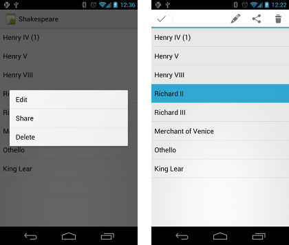
Contextual menu
Android provides two types of contextual menus:
- A context menu, appears as a floating list of menu items when the user performs a long tap on a View. It is typically used to modify the View or use it in some fashion.
- A contextual action bar, appears at the top of the screen in place of the app bar or underneath the app bar, with action items that affect one or more selected View elements.
The steps to create the context menu are as follows:
- Create the XML menu resource file
- Register a View to the context menu using
RegisterForContextMenupassing in the view. - Override the
OnCreateContextMenuand inflate the menu - Override the
OnContextItemSelectedto handle menu item clicks - Create a method to perform an action for each of the context menu item
Creating the XML resource
- Create an XML file in Resources -> menu folder.
- Add the context menu items uisng the
<item ..>tags
1 2 3 4 | <item android:id="@+id/context_edit" android:title="Edit" android:orderInCategory="10"/> |
Register a View for the context menu
After creating the view register it as follows:
1 2 | TextView textView = FindViewById<TextView>(Resource.Id.title); RegisterForContextMenu(textView); |
Override the OnCreateContextMenu
Override the OnCreateContextMenu as follows :
1 2 3 4 | public override void OnCreateContextMenu(IContextMenu menu, View v, IContextMenuContextMenuInfo menuInfo) { base.OnCreateContextMenu(menu, v, menuInfo); } |
Inflate the menu using the MenuInflater class as follows:
1 | MenuInflater.Inflate(Resource.Menu.menu_context, menu); |
The complete method should now be as follows:
1 2 3 4 5 | public override void OnCreateContextMenu(IContextMenu menu, View v, IContextMenuContextMenuInfo menuInfo) { base.OnCreateContextMenu(menu, v, menuInfo); MenuInflater.Inflate(Resource.Menu.menu_context, menu); } |
The parameter to the method:
menu: is the context menu to be builtv: is the view that registered for the context menumenuinfo: Is the extra information about the view registered for the context menu. This varies depending on the view, e.g the RecyclerView or GridView will have a row id, position or a child view
MenuInflater
The MenuInflater is a property defined on the class. It takes two parameters, the resource id for the XML resource to load and the menu to inflate the resource into.
Handle selected menu items
When the menu item is clicked, the system calls OnContextItemSelected method. Override the method as below:
1 2 3 4 | public override bool OnContextItemSelected(IMenuItem item) { return base.OnContextItemSelected(item); } |
We then handle each menu item with an if or switch statement. We use the ItemId to find which id was clicked:
1 2 3 4 5 6 7 8 9 10 11 12 13 14 15 16 17 | public override bool OnContextItemSelected(IMenuItem item) { switch (item.ItemId) { case Resource.Id.action_edit: EditNote(); return true; case Resource.Id.action_delete: DeleteNote(); return true; case Resource.Id.action_favorite: FavoriteNote(); return true; default: return base.OnContextItemSelected(item); } } |
Getting additional information from the menu
When using the context menu in an RecyclerView, you can cast the MenuInfo property on the item to gather more information supplied to the menu item.
When you long-click on the TextView, the popup should now show up as depicted in the image below:
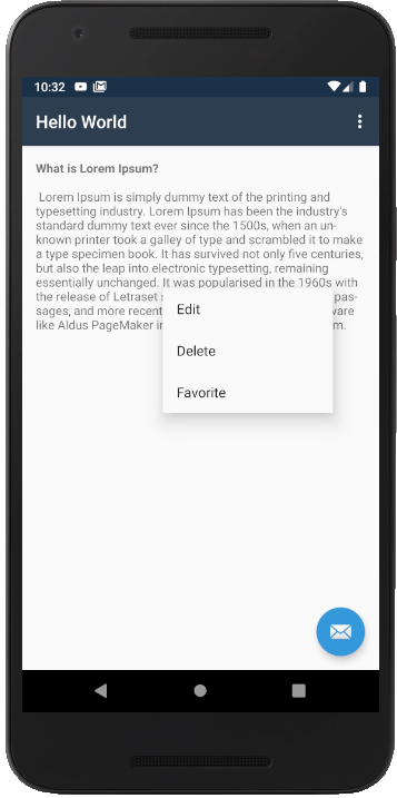
Contextual action bar
A contextual action bar appears at the top of the screen to present actions the user can perform on a View after long-clicking the View, as shown in the figure below. To create a contextual action bar, perform the following action:
- Create the XML menu resource file and assign an icon to each item.
- Implement the
ActionMode.Callbackinterface to handle theActionModelifecycle. - Set the long-click event to the view using the event
LongClick. Call theStartActionModewithin the handler.
Create the XML menu resource
Create the XML menu resource file in the Resource -> menu folder. Add icons to the menu items as follows:
1 2 3 4 5 6 7 8 9 10 11 12 13 14 15 16 17 | <?xml version="1.0" encoding="utf-8"?> <menu xmlns:app="http://schemas.android.com/apk/res-auto" xmlns:android="http://schemas.android.com/apk/res/android"> <item android:id="@+id/action_edit" android:icon="@android:drawable/ic_menu_edit" android:title="Edit" /> <item android:id="@+id/action_delete" android:icon="@android:drawable/ic_menu_delete" android:title="Delete" /> <item android:id="@+id/action_favorite" android:icon="@android:drawable/star_off" android:title="Favorite" /> </menu> |
We have created the menu items, given them id, title and icons.
Create the long-click event
We need to register a long-click event to show the contextual app bar menu.
1 2 3 4 5 6 7 8 9 | TextView textView = FindViewById<TextView>(Resource.Id.title); textView.LongClick += (sender, e) => { if(actionMode == null) { actionMode = StartActionMode(this); } ((View)(sender)).Selected = true; }; |
The actionMode variable is defined as follows in the MainActivity,
1 | private ActionMode actionMode; |
Implement the interface
Implement the interface on the MainActivity as follows :
1 2 3 | public class MainActivity : AppCompatActivity, ActionMode.ICallback { .... } |
The ActionMode.ICallback contains the following methods that needs to be implemented:
OnActionItemClicked- Handle the click of the itemOnCreateActionMode- Inflate the menu resource fileOnDestroyActionMode- Handle actions when the menu is closedOnPrepareActionMode- Handle additional actions once the menu is created
Inflate the menu resource
Inflate the menu resource XML file as follows:
1 2 3 4 5 6 7 | // Called when the action mode is created; public bool OnCreateActionMode(ActionMode mode, IMenu menu) { mode.Title = "Actions"; MenuInflater.Inflate(Resource.Menu.menu_context, menu); return true; } |
Handle the item clicks
Handle the item clicks in the OnActionItemClicked as follows:
1 2 3 4 5 6 7 8 9 10 11 12 13 14 | // Called when the user selects a contextual menu item public bool OnActionItemClicked(ActionMode mode, IMenuItem item) { switch (item.ItemId) { case Resource.Id.action_edit: EditNote(); mode.Finish(); return true; .... default: return false; } } |
The Finish method closes the app bar after performing the action. Handle all the menu item clicks in the switch statement.
In the OnDestroyActionMode set the actionMode variable to null as follows:
1 2 3 4 5 | // Called when the user exits the action mode public void OnDestroyActionMode(ActionMode mode) { actionMode = null; } |
For the OnPrepareActionMode return false:
1 2 3 4 | public bool OnPrepareActionMode(ActionMode mode, IMenu menu) { return false; } |
When you long-click the TextView, you should now have something like the figure below:
Popup menu
A PopupMenu is a modal menu anchored to a View. It appears below the anchor view if there is room, or above the view otherwise.
To show the PopMenu, you do the following:
- Create the menu resource file
- Add the View that show the PopMenu
- Inflate the PopMenu
- Handle the OnMenuItemClick for the PopMenu items
Create the menu resource file
We create the file as the other menu resources in the Resources -> menu folder.
Add the View to handle the click
The a View to your layout file to handle the click event
1 2 3 4 5 6 7 | <ImageButton android:layout_below="@id/title" android:id="@+id/optionButton" android:background="@android:color/transparent" android:src="@drawable/ic_more" android:layout_width="wrap_content" android:layout_height="wrap_content" /> |
Handle the event
Create an event handler for the view:
1 2 3 4 | ImageButton imageButton = FindViewById<ImageButton>(Resource.Id.optionButton); imageButton.Click += delegate { ... } |
Inflate the menu
Within the event handler we inflate the menu resource file into the PopupMenu as follows:
1 2 | var popUpMenu = new PopupMenu(this, imageButton); popUpMenu.MenuInflater.Inflate(Resource.Menu.menu_main, popUpMenu.Menu); |
Handle menu items clicks
Handle the menu item clicks as follows:
1 2 3 4 5 6 7 8 9 10 11 12 | popUpMenu.MenuItemClick += (object sender, PopupMenu.MenuItemClickEventArgs e) => { switch (e.Item.ItemId) { case Resource.Id.action_edit: ... break; case Resource.Id.action_delete: ... break; } }; |
Show the popup
Last we need to show the popupmenu:
1 | popUpMenu.Show(); |
The complete, code should look as follows:
1 2 3 4 5 6 7 8 9 10 11 12 13 14 15 16 17 18 19 20 | ImageButton imageButton = FindViewById<ImageButton>(Resource.Id.optionButton); imageButton.Click += delegate { var popUpMenu = new PopupMenu(this, imageButton); popUpMenu.MenuInflater.Inflate(Resource.Menu.menu_main, popUpMenu.Menu); popUpMenu.MenuItemClick += (object sender, PopupMenu.MenuItemClickEventArgs e) => { switch (e.Item.ItemId) { case Resource.Id.action_edit: break; case Resource.Id.action_delete: break; case Resource.Id.action_favorite: break; } }; popUpMenu.Show(); }; |
Inflating menu shortcut
We could also have done popUpMenu.Inflate(Resource.Menu.menu_main); by calling the Inflate method without getting a MenuInflater to inflate the menu resource file.